Illuminated Letters by moendopi (TB)
All of these letters were drawn by hand, using pen and ink, then filled in and decorated using mainly gouache, a few watercolor, and one hobby acrylics. The designs are, unfortunately, not original to me. I follow examples out of a book, Illuminated Letters (sketchbook).
Things I learned or improved upon:
- How to better work with my dip pens
- How different inks behave
- What inks are water proof and which are not; which bleed; which are easily covered up
- Better control over gouache and watercolor. Modulating opacity and color intensity
- A feel for lines, curves, modulating the pen/nib's pressure to get different line weights or emphasis
The original goal before starting this was to make a palm sized book, illustrate/illuminate the letters, and then bind the book. I didn't do that. These letters took a lot longer than I expected. It did get easier and quicker as I went along.
The faces in the U were a bit of a surprise. I wasn't actually expecting them to turn out well. I've never been great at drawing. My under-drawings are done with a lot of sketching. I then use either black India Ink if I want the lines to show (as in the later letters where I used water color) or Higgins Drawing ink (Russet or Blue color) for a more permanent under-drawing that will get covered up. I choose russet or blue based on what the main color will be, so the under-drawing will act as a guide that will disappear under the gouache. I use the India ink for water color as it is water proof and the black is intense.
I wish I had used the gouache in a more bold and opaque way in the M as the under-drawing shows and it doesn't look as good as if I had done it like the first O. The first Z is done with India Ink where I made strong, deliberate stroke with the pen, then added color using watercolor.
I've found for drawing I prefer fairly stiff drawing nibs: #102 and #104 for fine work and where I want there to be some flex. The #107 is stiffer and makes a more consistent line.
I've never been very good with humanoid shapes, faces, or anatomically correct things, i.e., insects, animals, humans. Thus, I was pleasantly surprised that the birds and mice I did turned out okay. The butterflies, eh. The book has examples of dogs, snails, mice, rabbits, butterflies, humans, Pegasuses(?), and a little faerie/sprite. I didn't do those. I could have, but in the interest of time, I didn't.
Another goal was to have completely redone the Goosey Goosey Gander poem with better letters, that is, these; but also to have done the writing itself again. I probably still will, and instead of the spidery lettering I have come to use when I write with the #56 or #512, I'd probably use a chisel tip and write in a uncial hand. I could write bigger and the letters would have rounder shape. Not copper plate, or 'wedding letters', but something much more close to what one sees in the early medieval period, often what Irish monks were using (though they were common across western Europe from the 600's-1000's). They're fairly easy and my hand writing, ugly as it may be most of the time, has retained some of these shapes.
On the whole, these took longer than I had expected. I actually started letters A-G before the tilde 30.6 began.
A
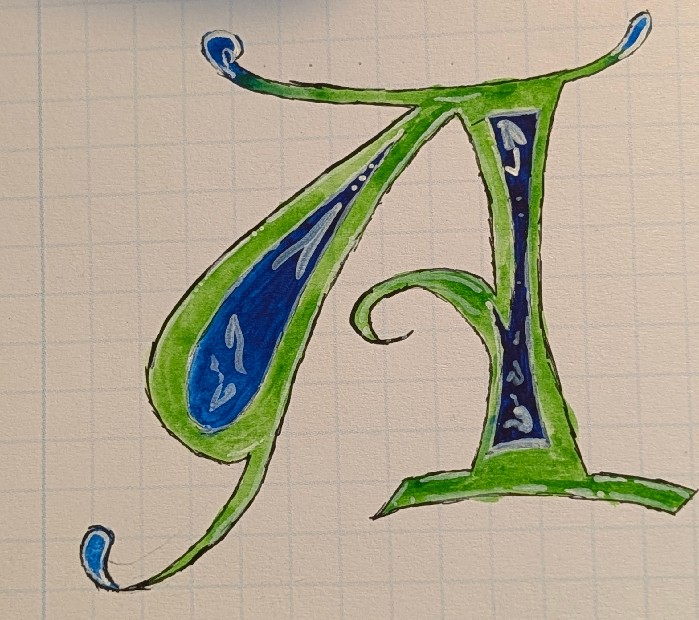
This was the first and kind of feels like beginner's luck
B
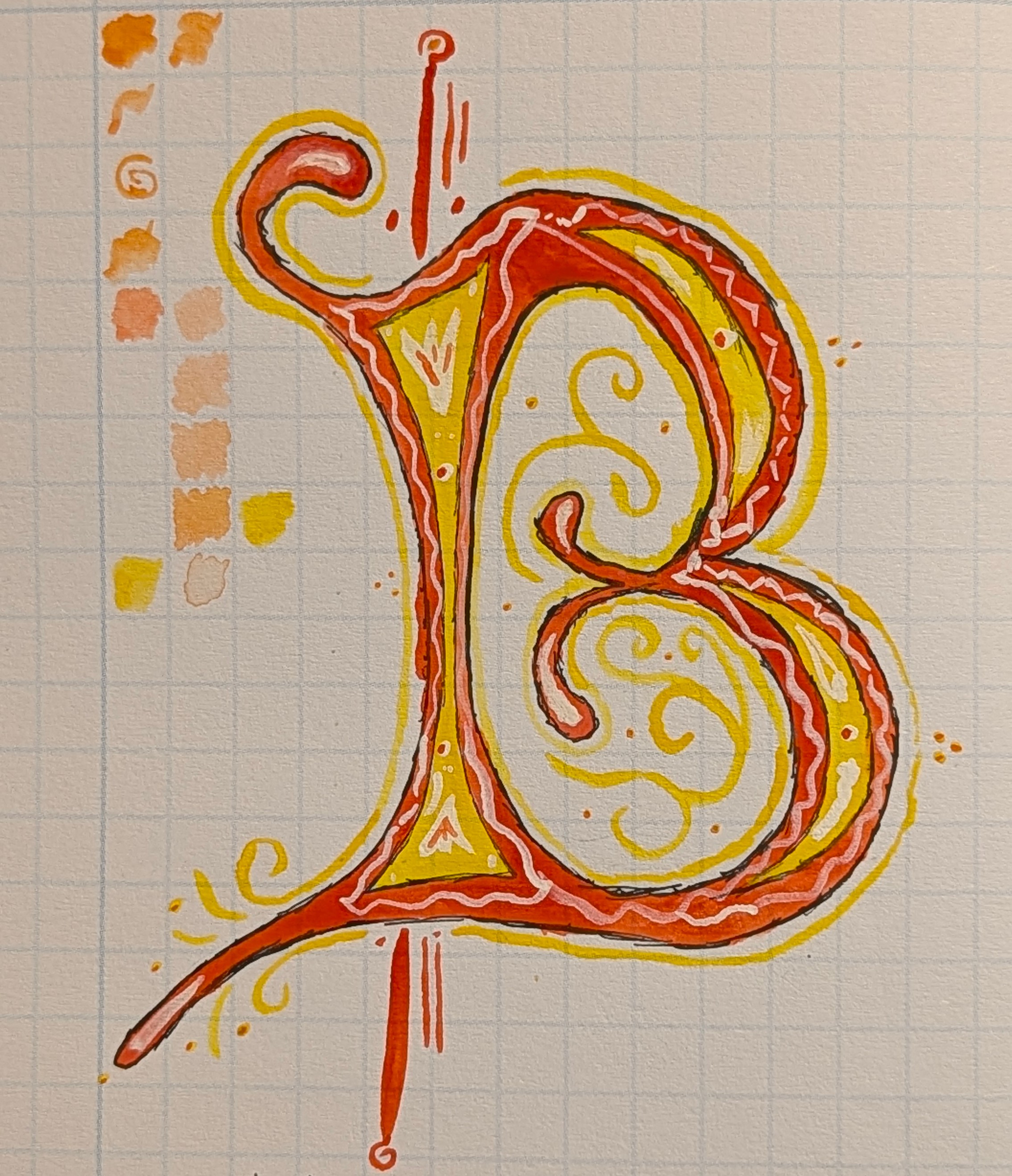
Boy, getting the curves freehand were kind of tricky.
C
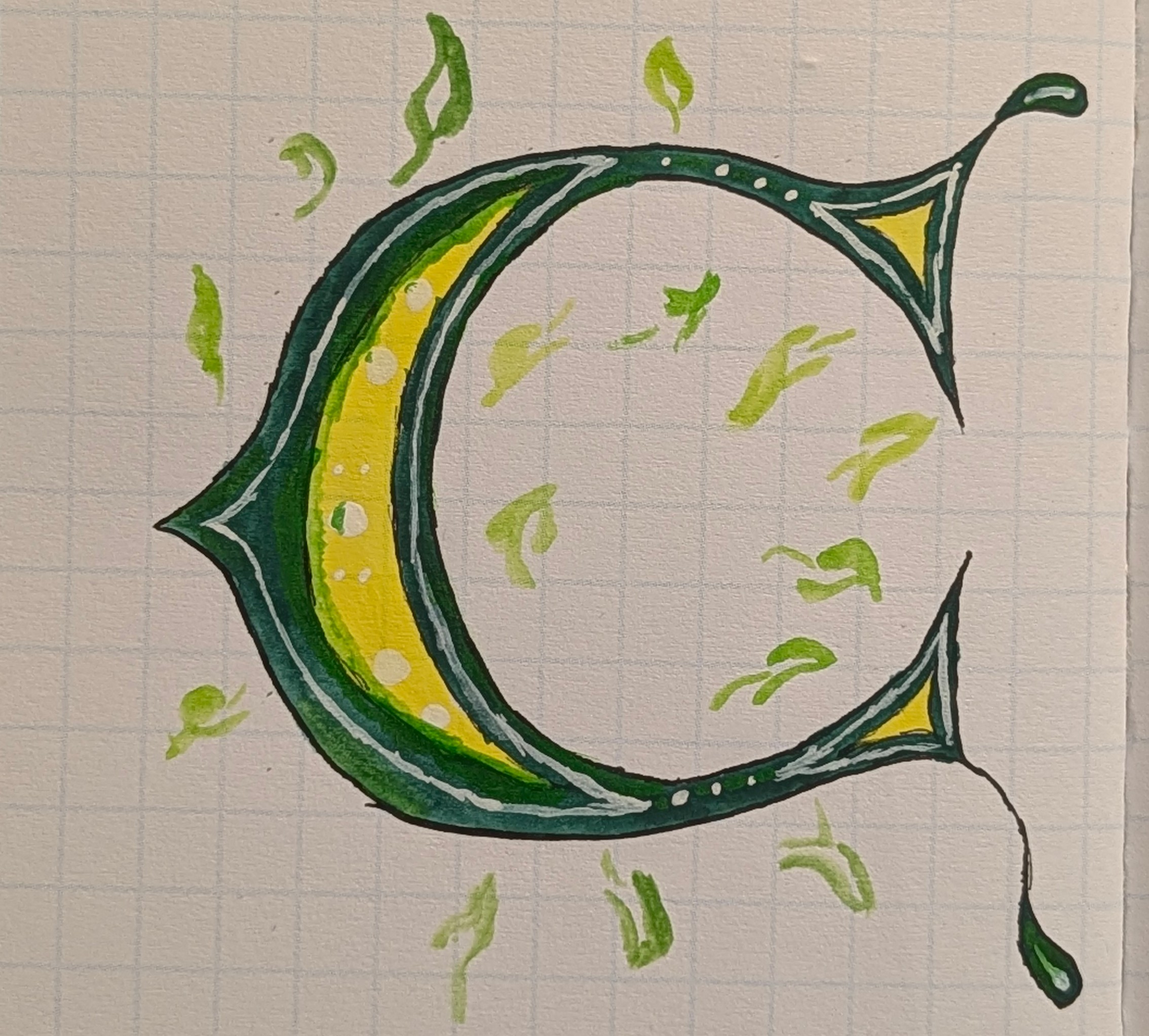
Here I was still getting a feel for the gouache, how the colors behave, the feel of the brush
D
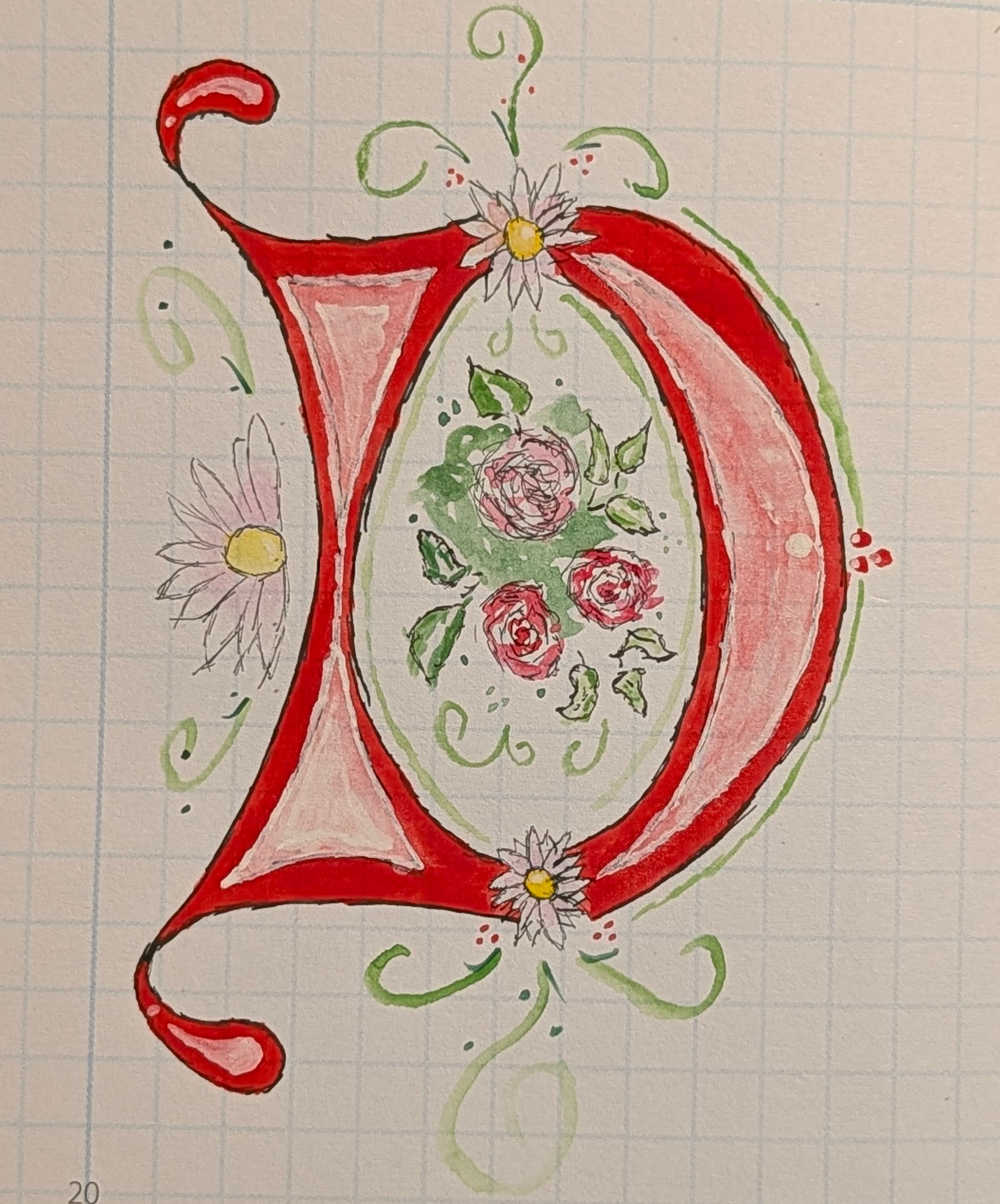
This kind of detail was new to me, but it let me really start getting a feel for the nibs and line work
E
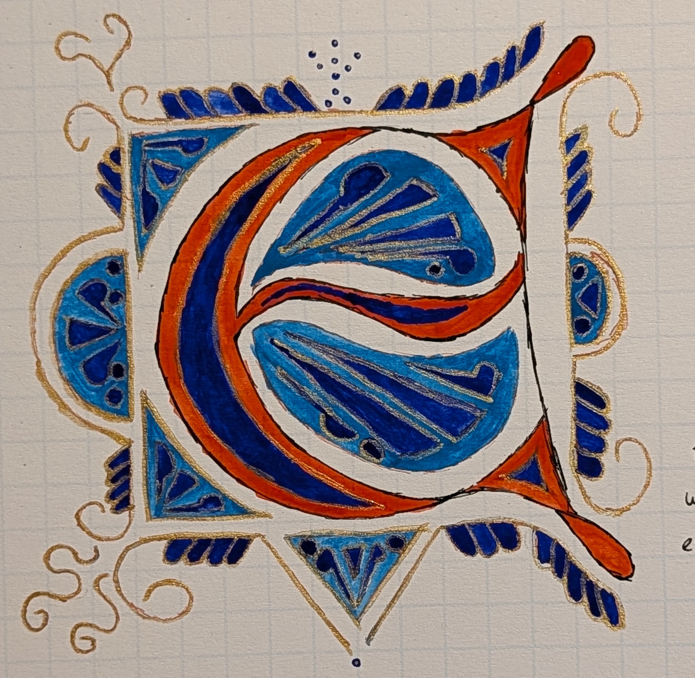
A fancy E with some metallic gold
F
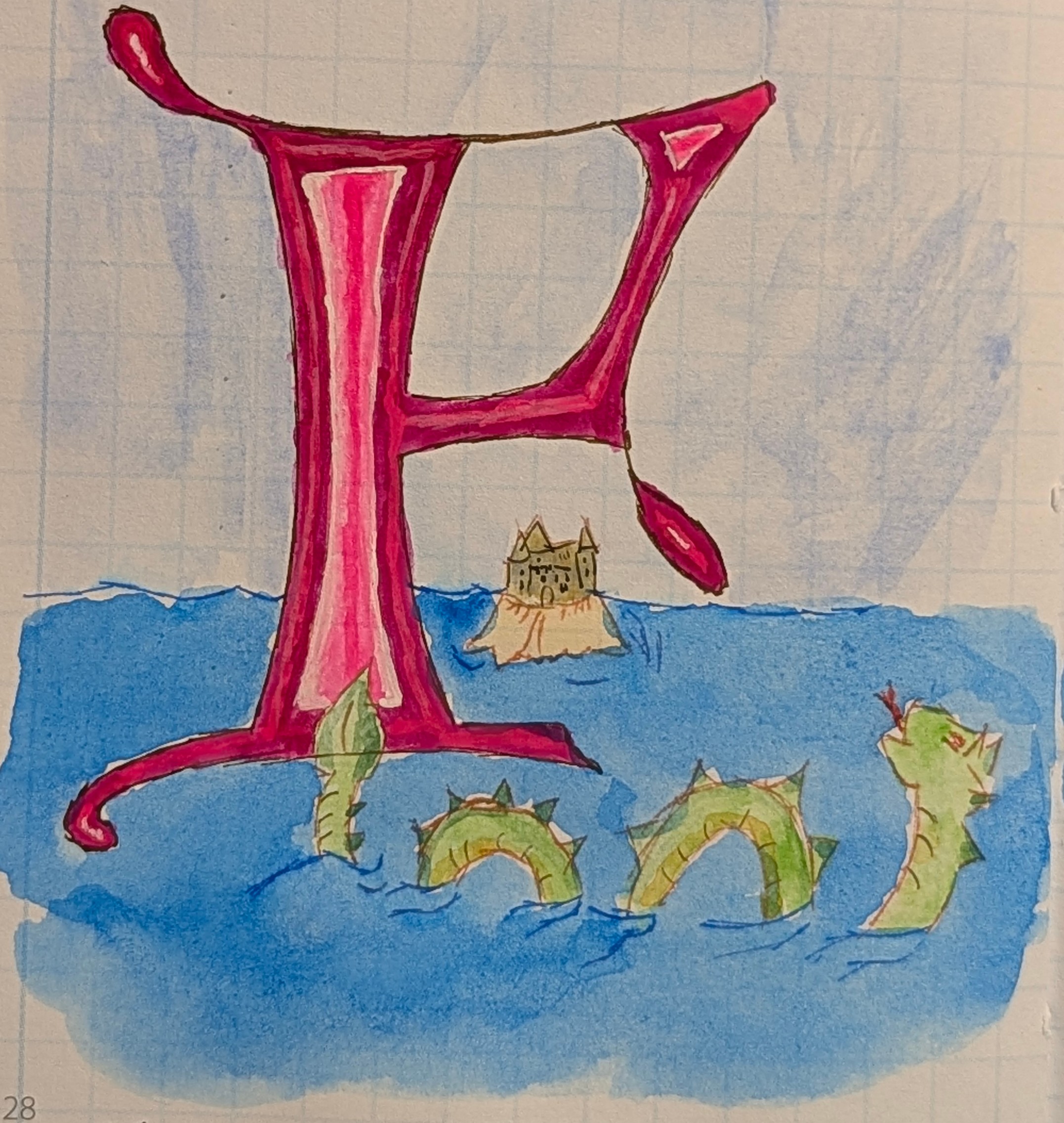
This dragon and sand castle are a lot easier than F is for fumarole
G
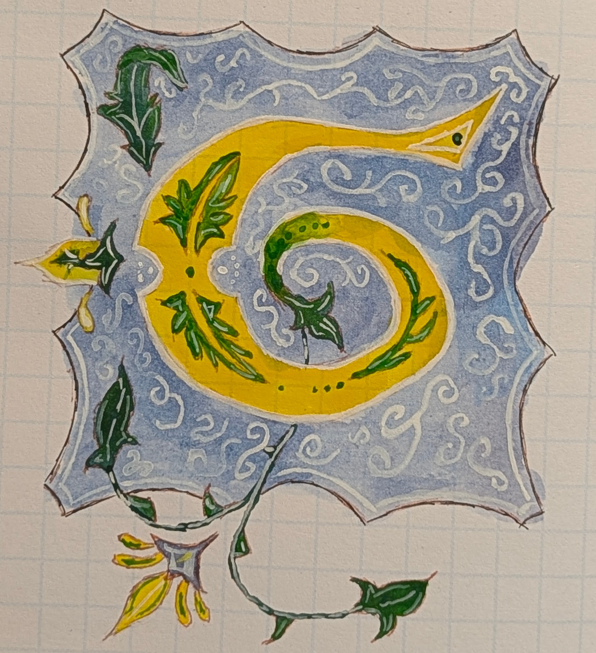
G was a struggle, both in getting the curves and proportions right, but also that background. It was a lot.
H
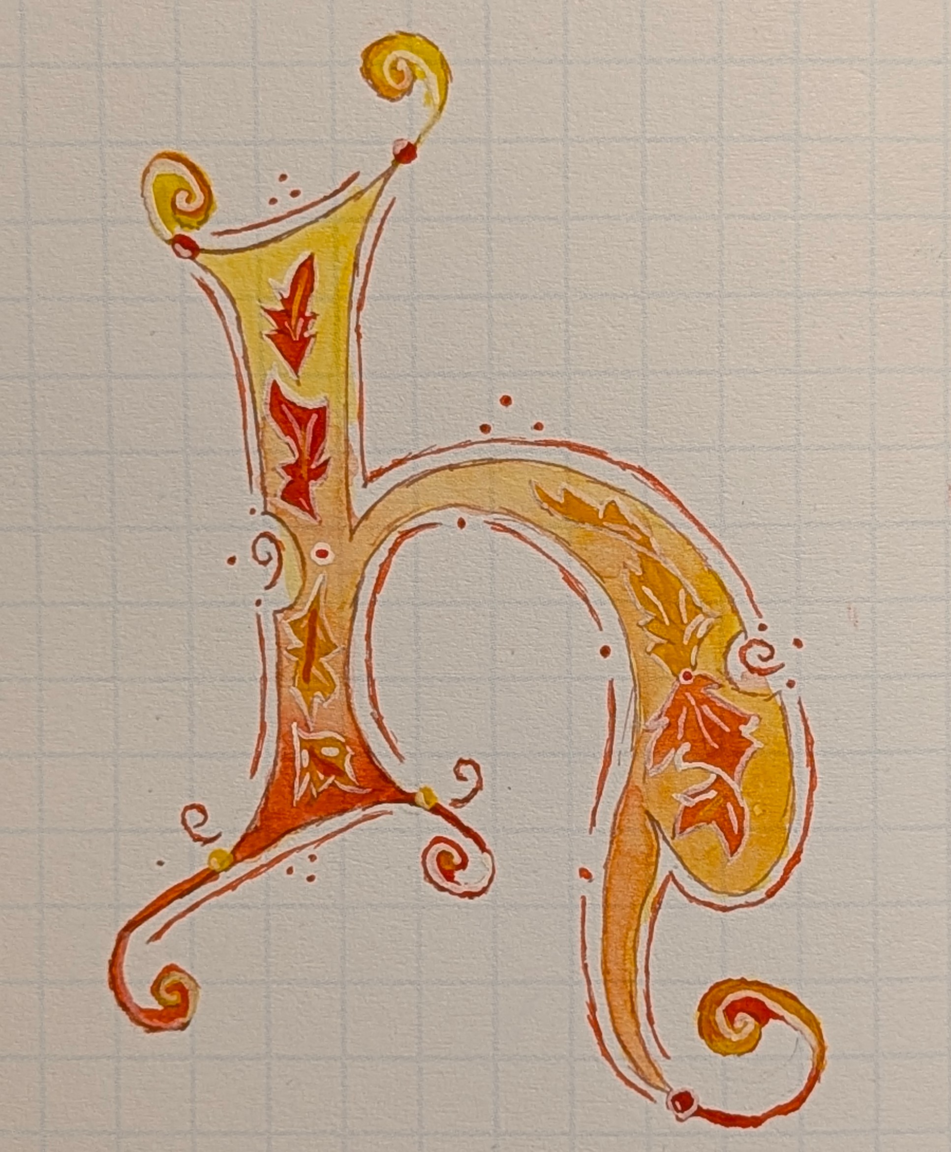
G made H easy in comparison. I really enjoy how the white outlines make the leaves pop.
I
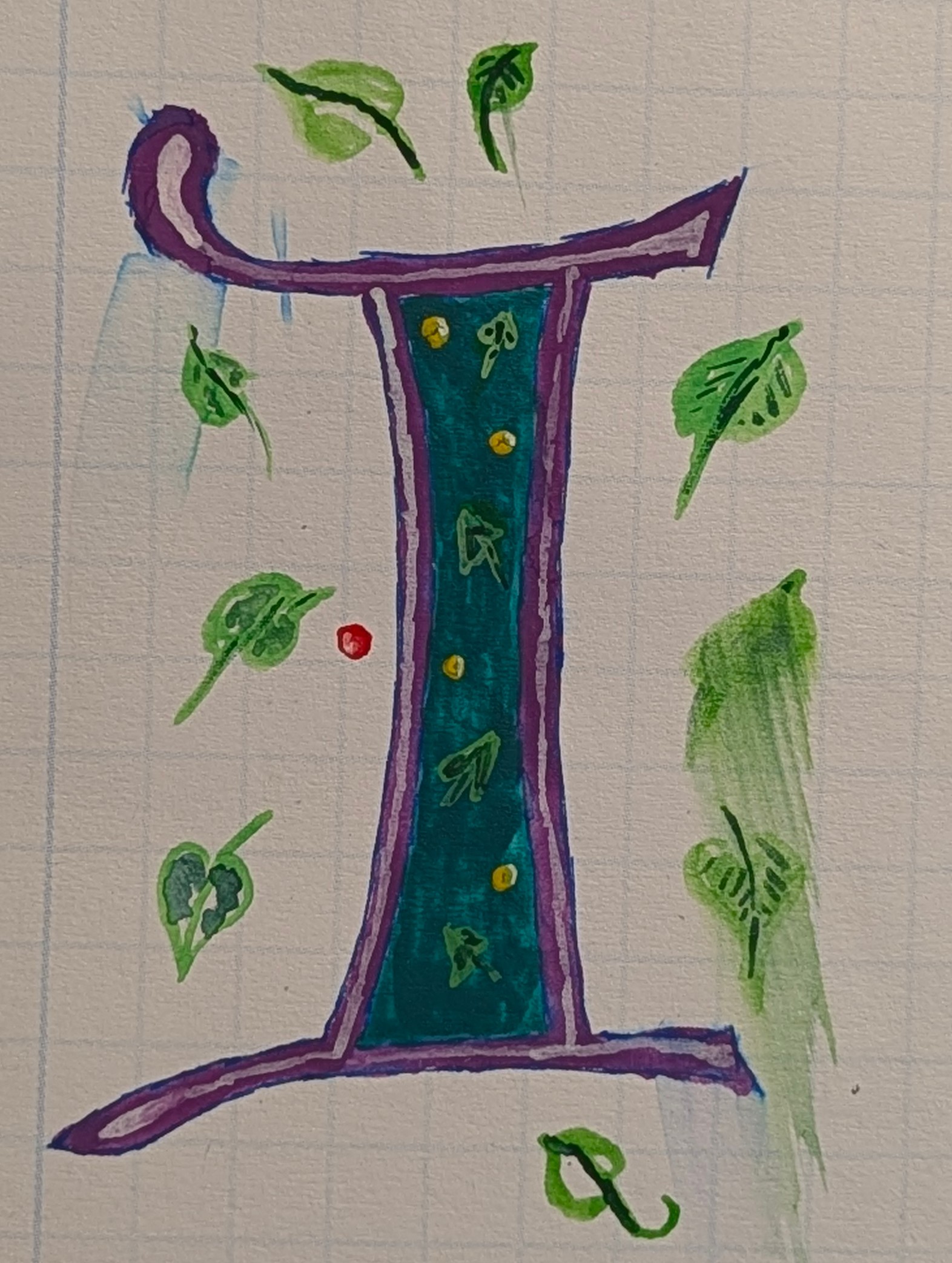
(Dark) lilac and viridian green remind me of pop-tarts. The colors weren't what I had aimed for. The leaves are smeared because the Crime Cat spilled water on the painting in the night.
J
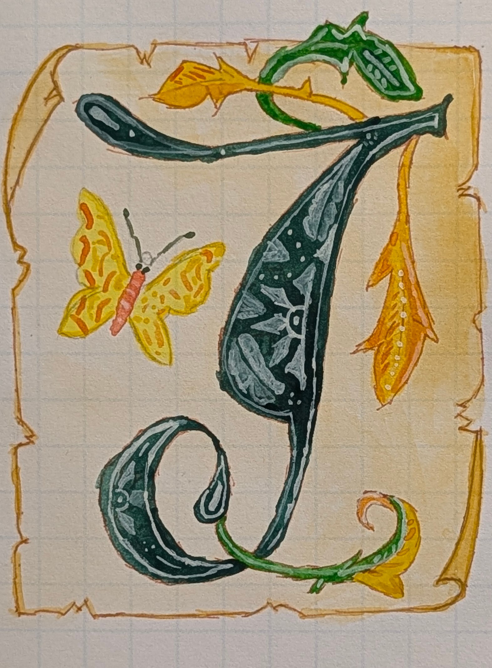
The drawing of the sheet of paper turned out better than the J. I did learn more of how to layer the white parts inside the body of letter with this.
J

I wanted to know how Army Painter hobby acrylics for minis would compare/perform. They're fine, but...
J
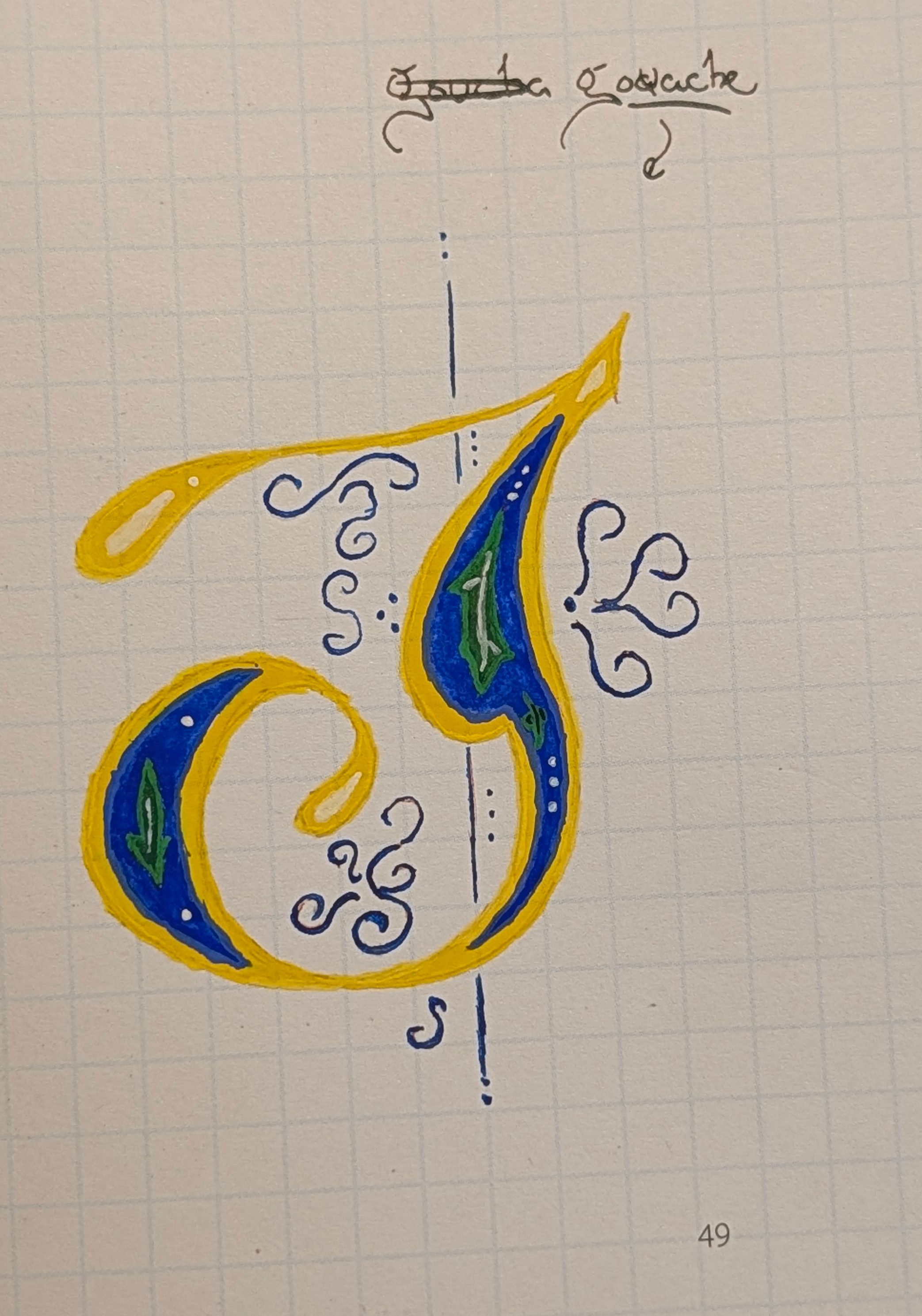
There is a certain quality in the way gouache presents itself.
K
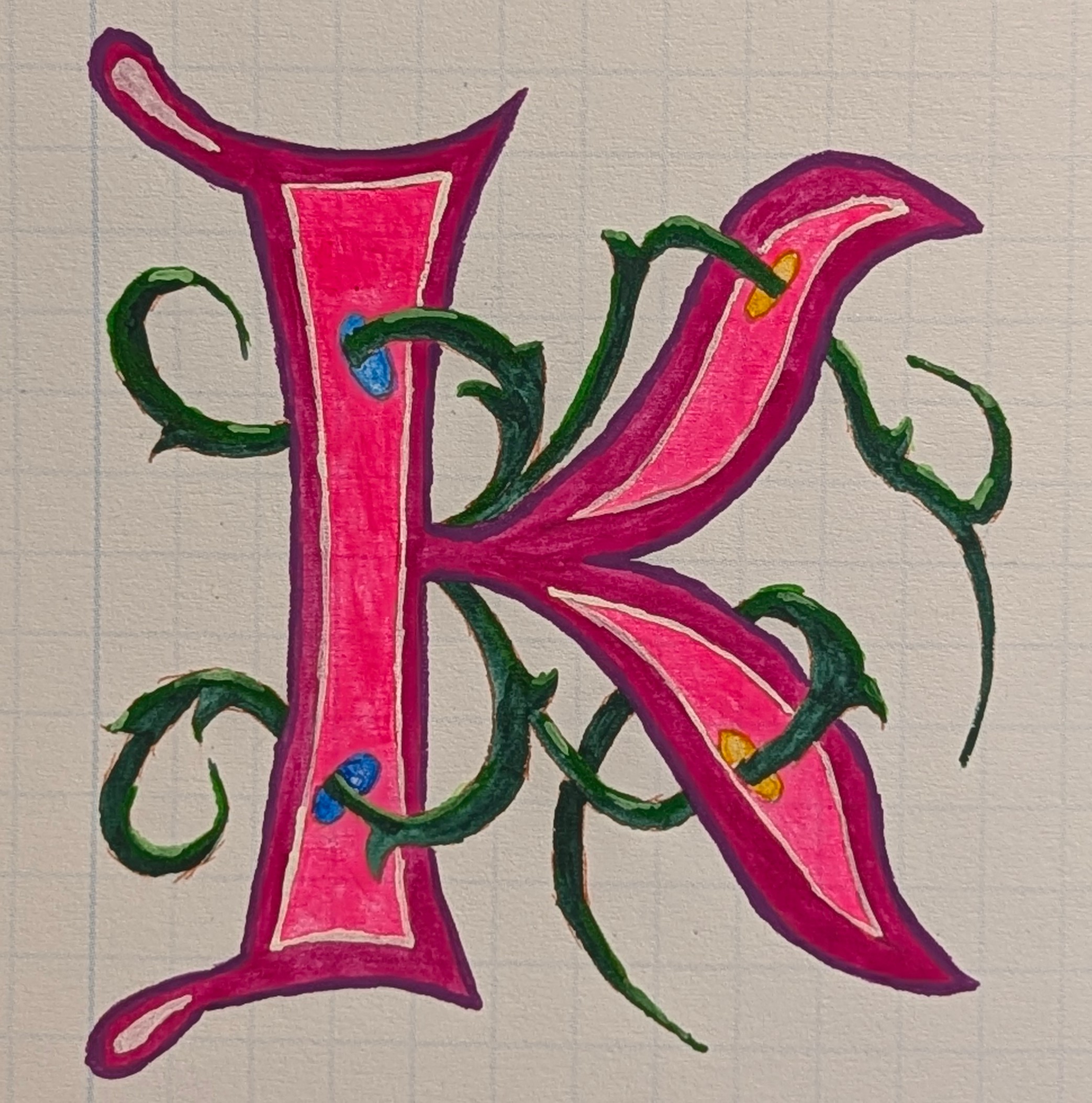
This one was fun. I didn't choose the colors. The vines are going through portals as in Portal, the game.
L
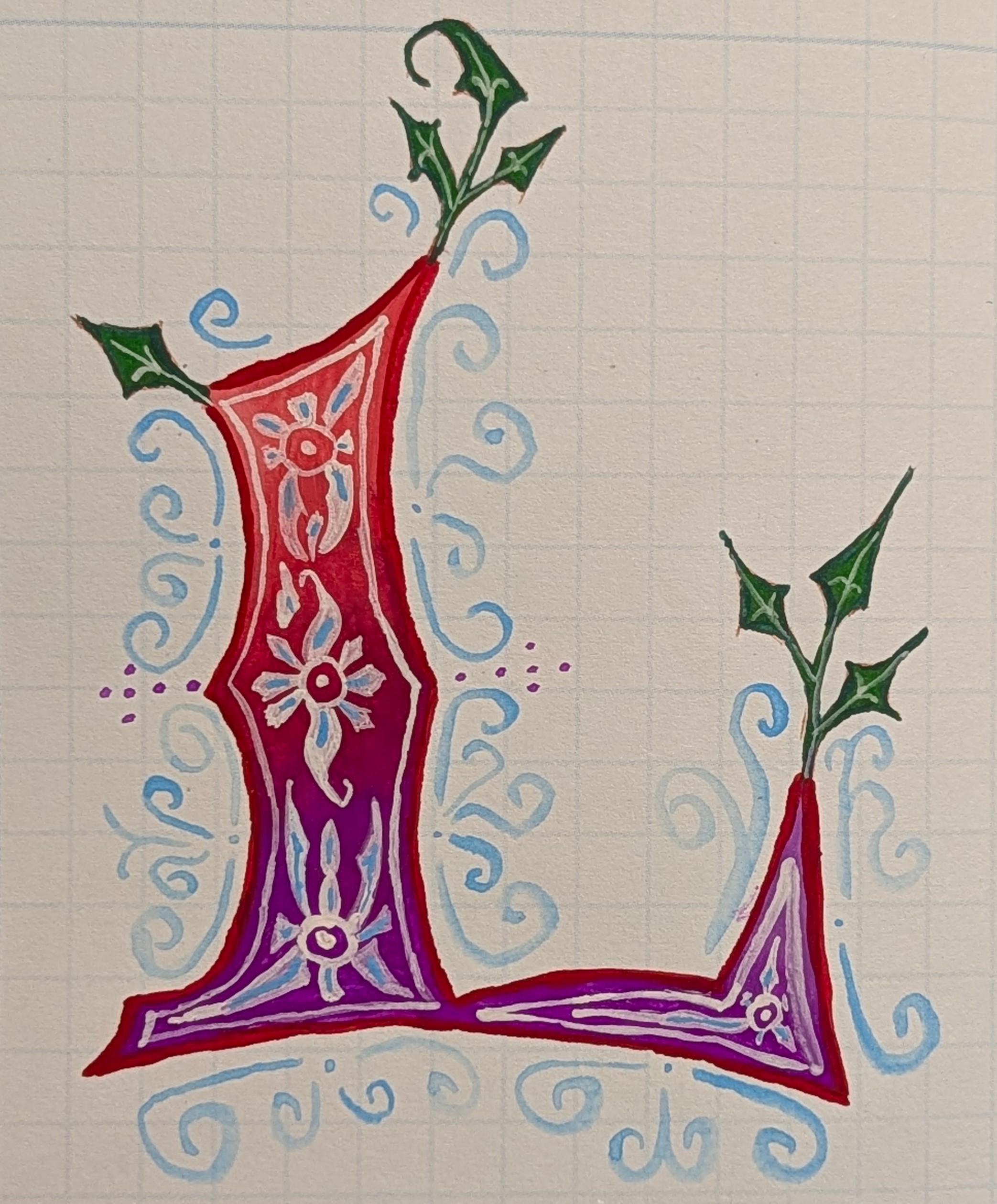
I enjoyed this L. I had just gotten some new gouache from Holbein, and one of those was Violet. Love that color. I lighten the top with some white, and the leaves in the center hide some of the unevenness of the paint in the center. Huzzah!
M
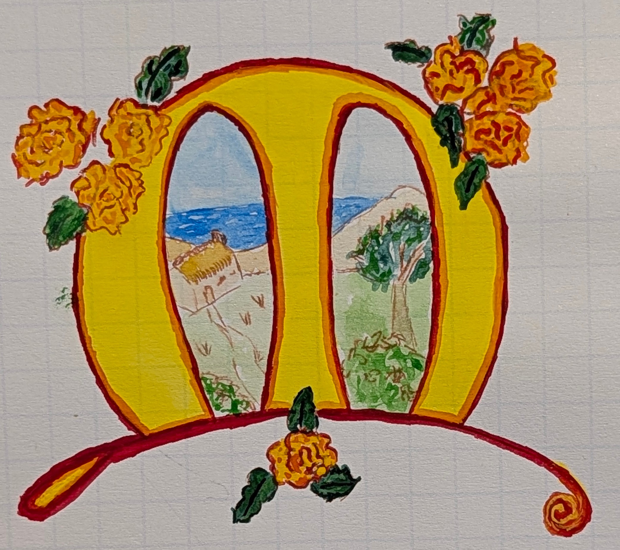
I really like this M. Lemon yellow is a wonderful color. The flowers gave me a chance to try out my newly acquired 'marigold' color from Holbein.
N
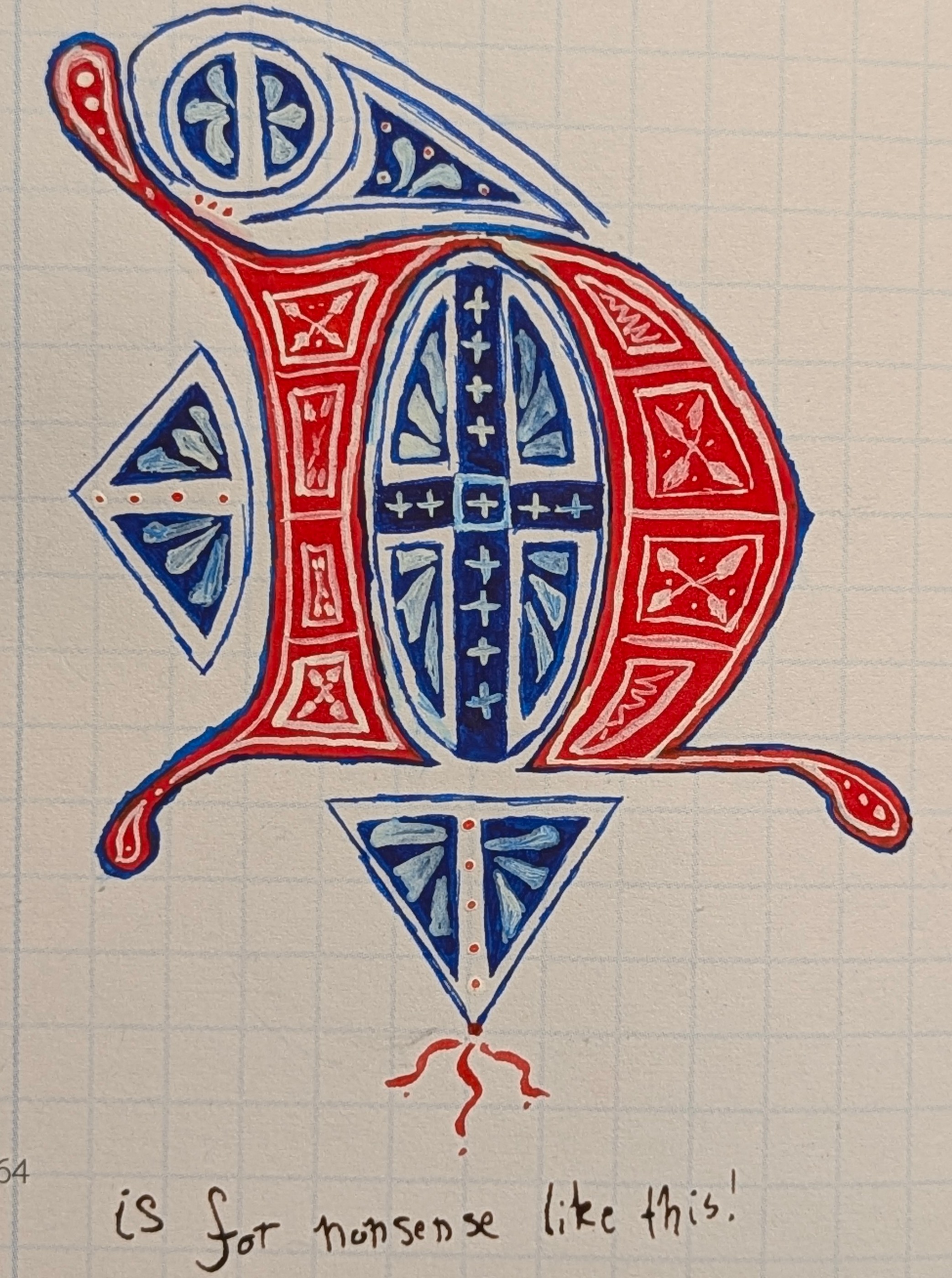
N is for Norway I guess. This one was less difficult after the G.
N
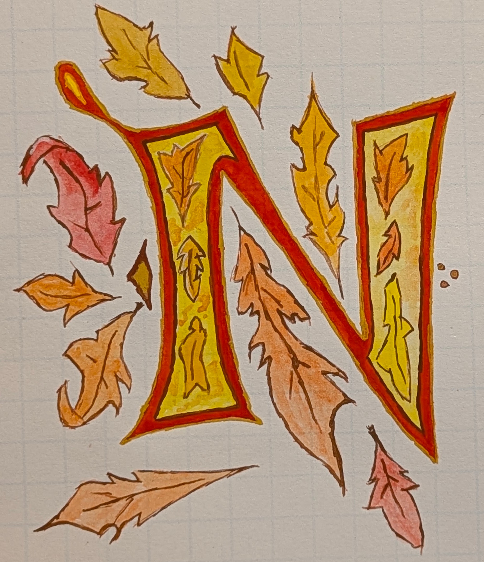
This N is for November.
O
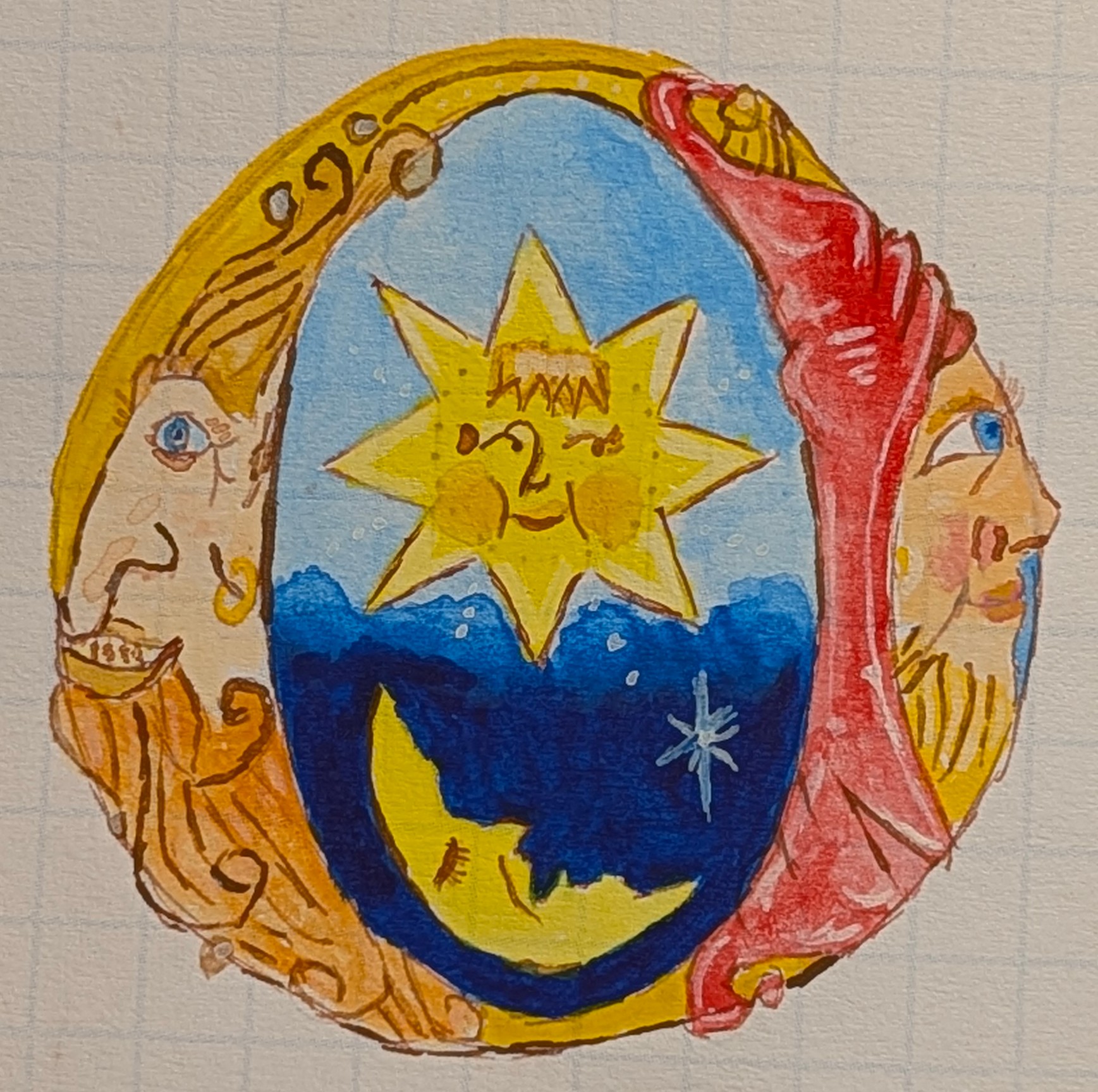
Faces are hard for my to draw. The one on the left didn't come out how I wanted but the one on the right did. I might have a bias due to being left handed. <shrugs>
O IS FOR OCEAN
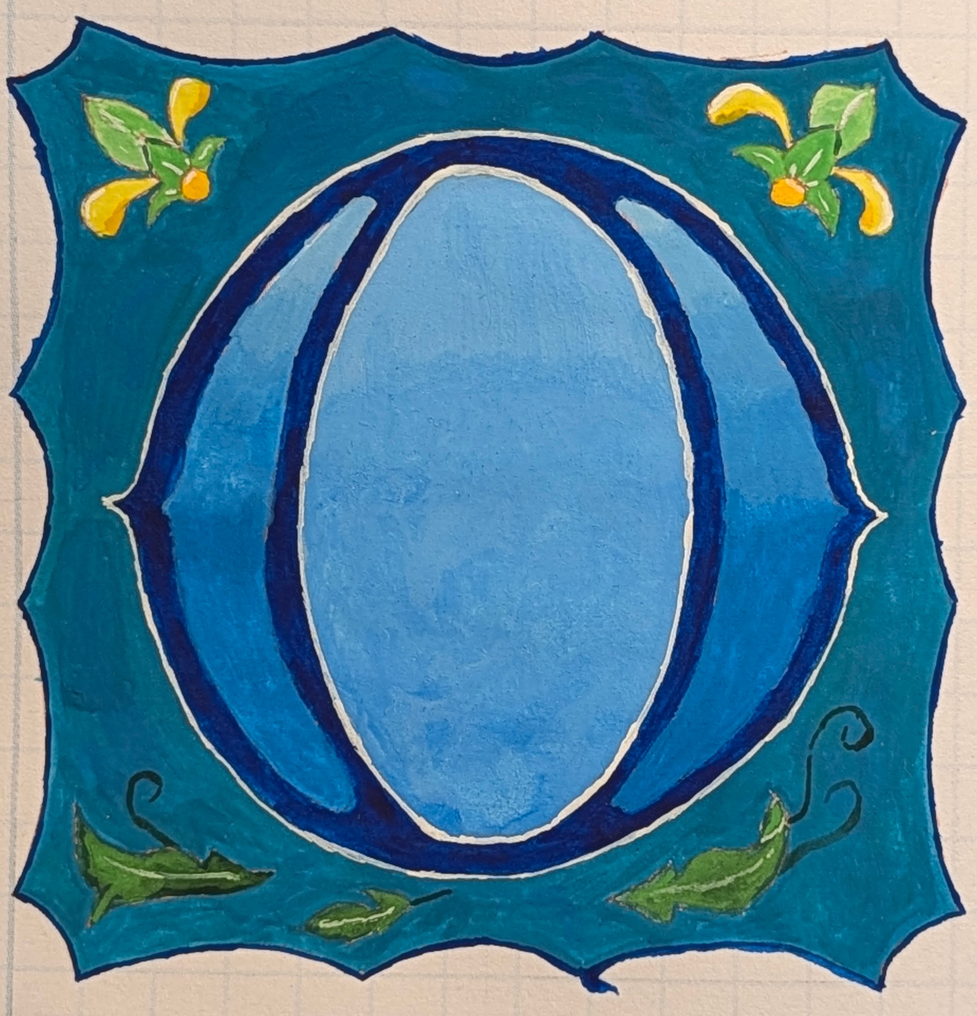
O is for ocean. I made use of a new Holbein Aqua Blue. Cerulean blue, Prussian blue, and Aqua blue make for an oceanic feel. I left out the jellyfish I planned out of fear of screwing the whole thing up.
P
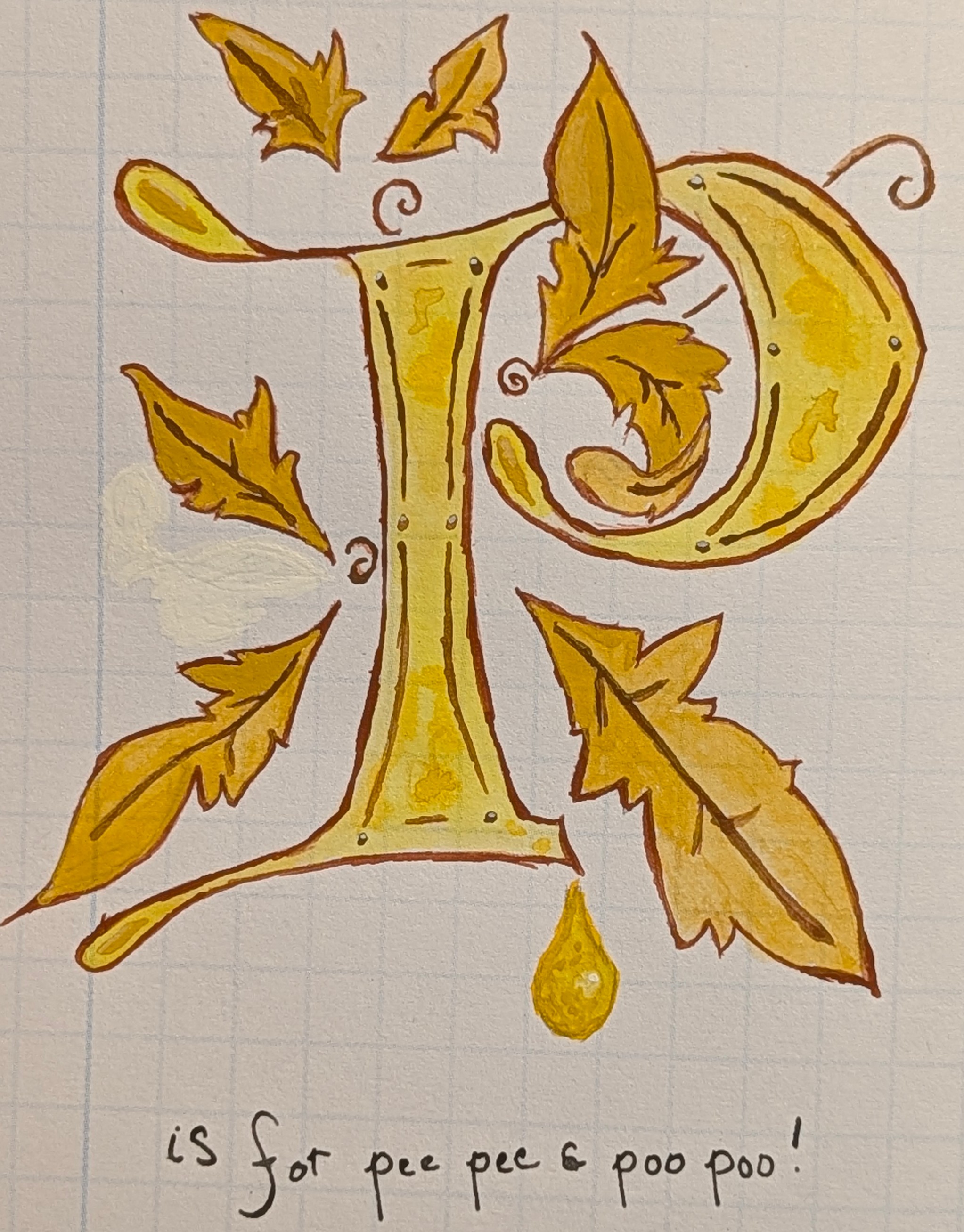
It's as childish as it seems. The dog pissed on the floor the night before. And pooped.
Q
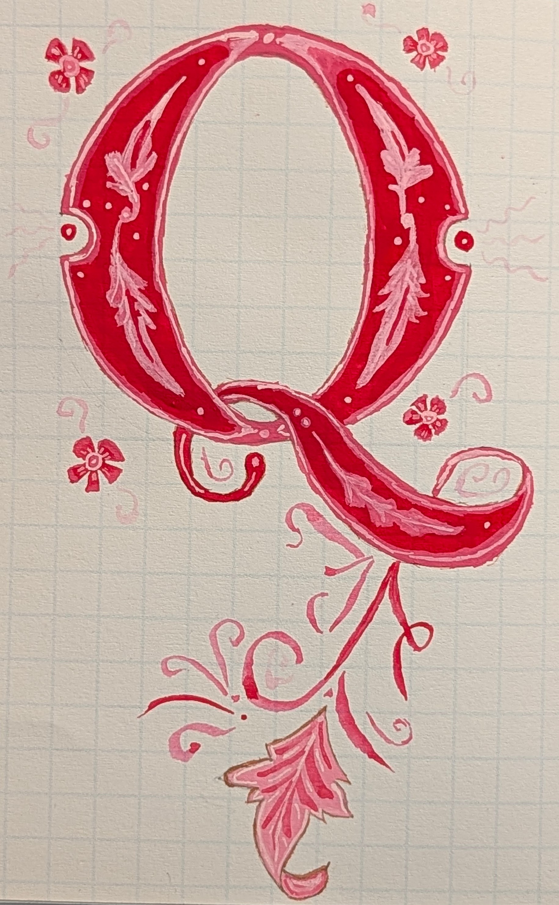
Windsor & Newton's Primary Red makes some fantastic pinks when mixed with titanium white. Therefore, this Q is monochromatic.
R
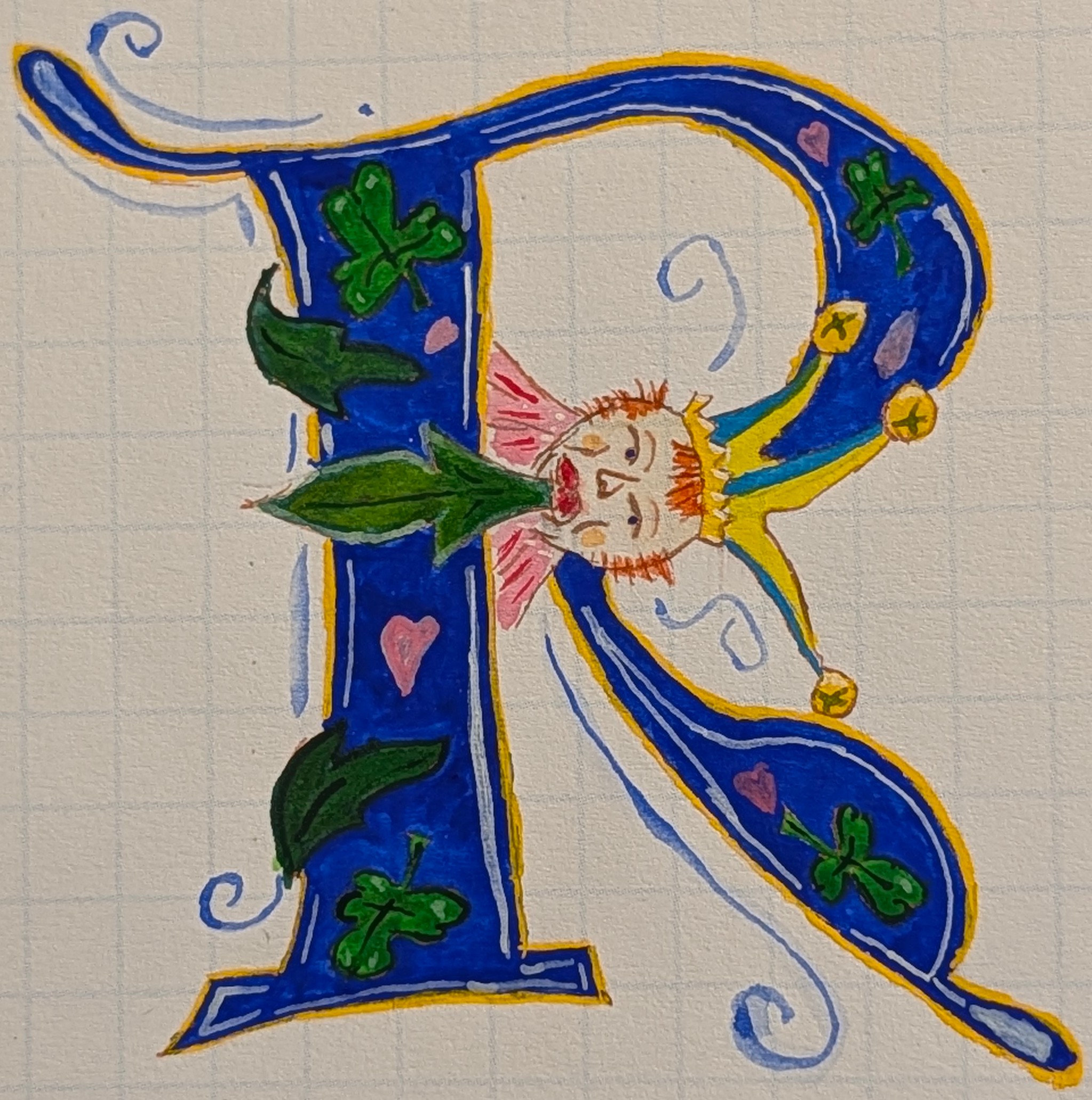
I love ultramarine blue. I've said I'm not great at faces. I worked on layering deep green and sap green for the leaves.
S
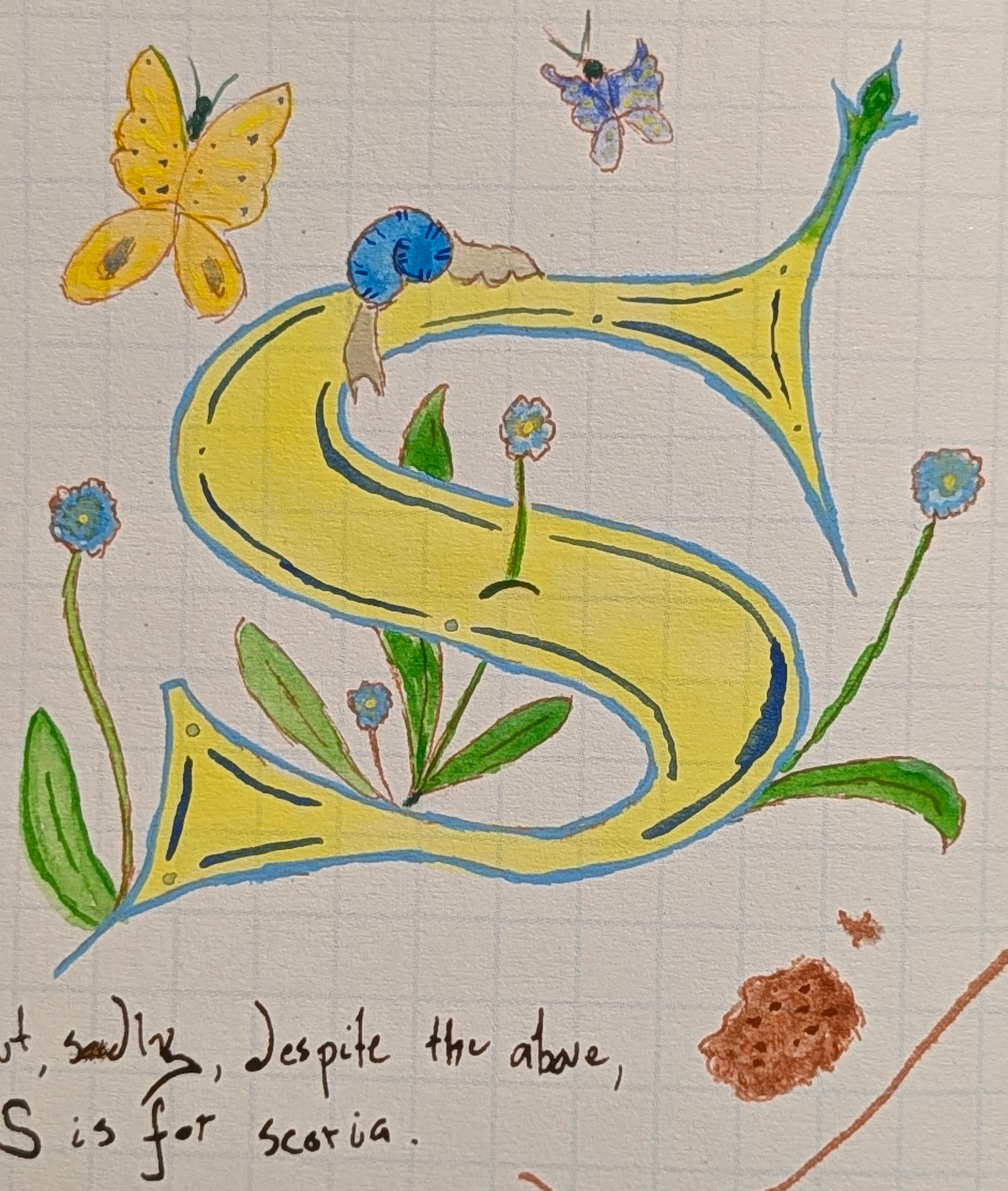
S is for scoria, but the color scheme says Sweden with lemon yellow and aqua blue. I actually made the snail look decent.
Scoria
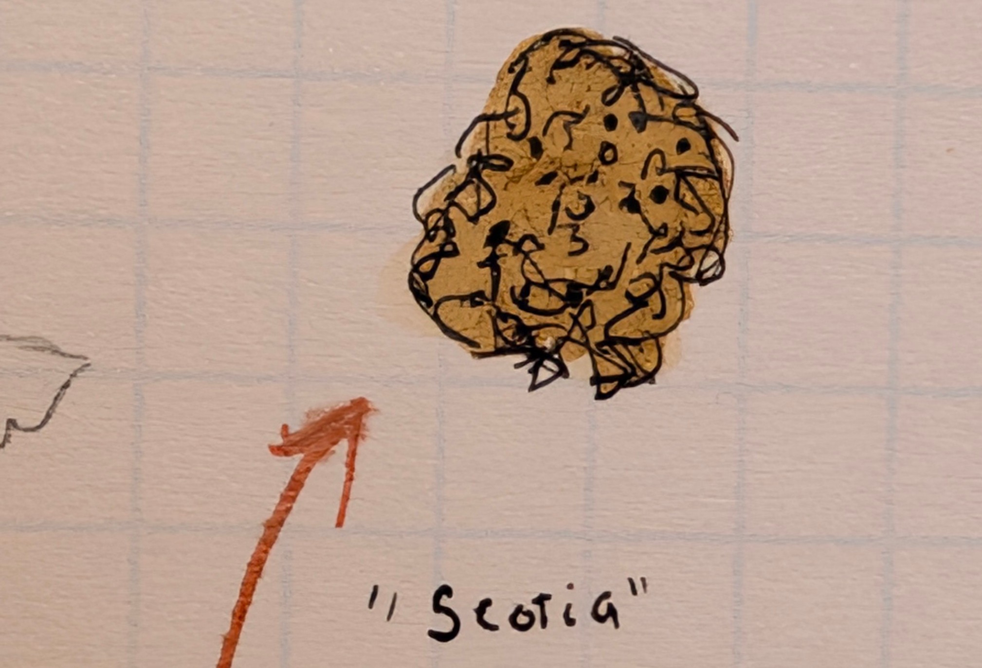
The original score looks janky because I put gouacheburnt sienna on top of the line work. The second attempt used India Ink and watercolor. Much better.
T
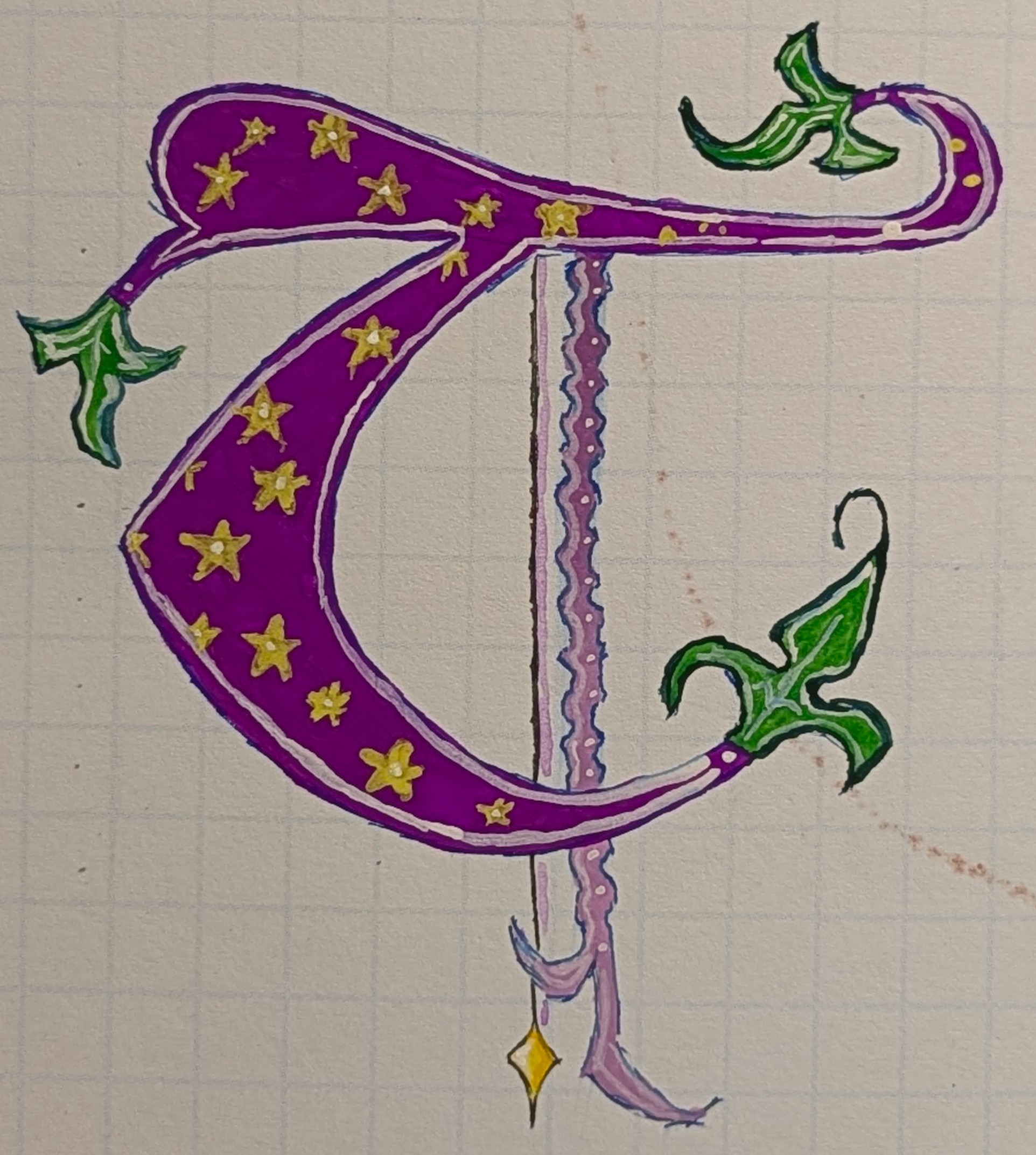
I was pleasantly surprised out how this turned out. That violet is wonderful. The mid yellow wasn't as striking for the stars, but that's okay. I used lilac and white for the squiggly stick. I skipped the Pegasus.
U - FACES
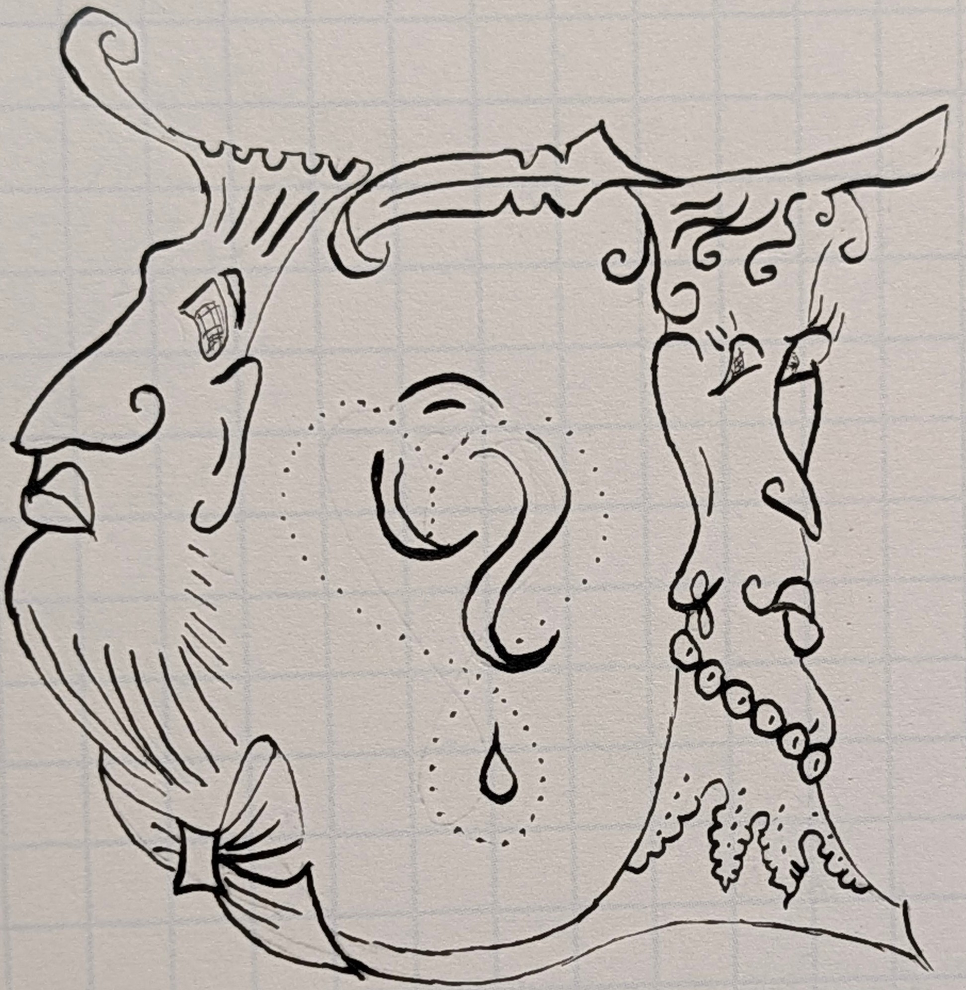
I didn't wanna ruin this with a potentially botched job with colors. Skin tone are tricky with my limited palette, so I opted to leave just the line work, which was kind of a first for me in using the #102 and #104 nibs + India ink.
U
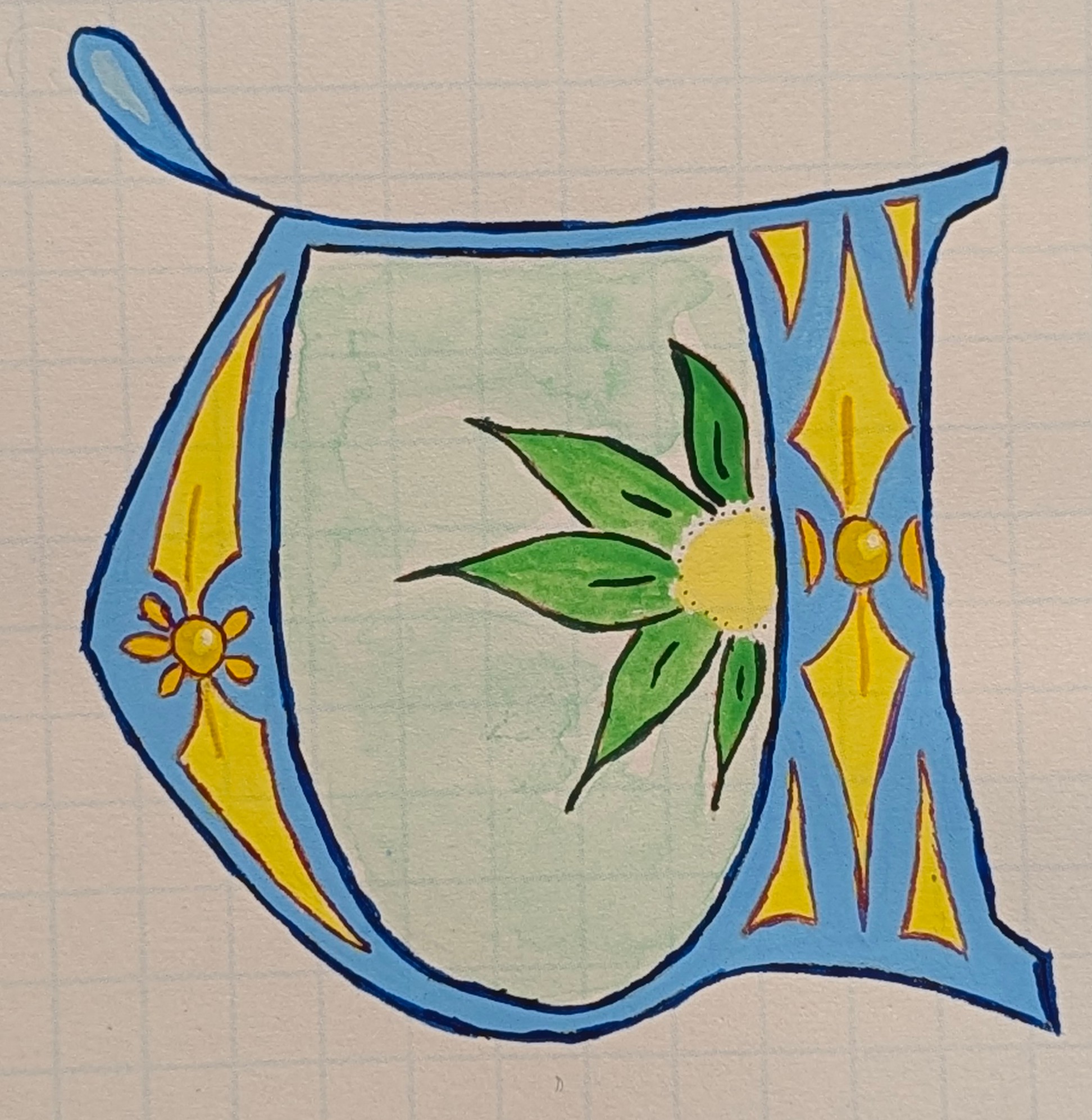
Since I didn't paint the first U, I did the second one. I like the emerald watercolor center, and the yellows and greens really pop. I used mauve watercolor to outline the yellow shapes because the mauve is dark but not black, yet contrasts nicely.
V
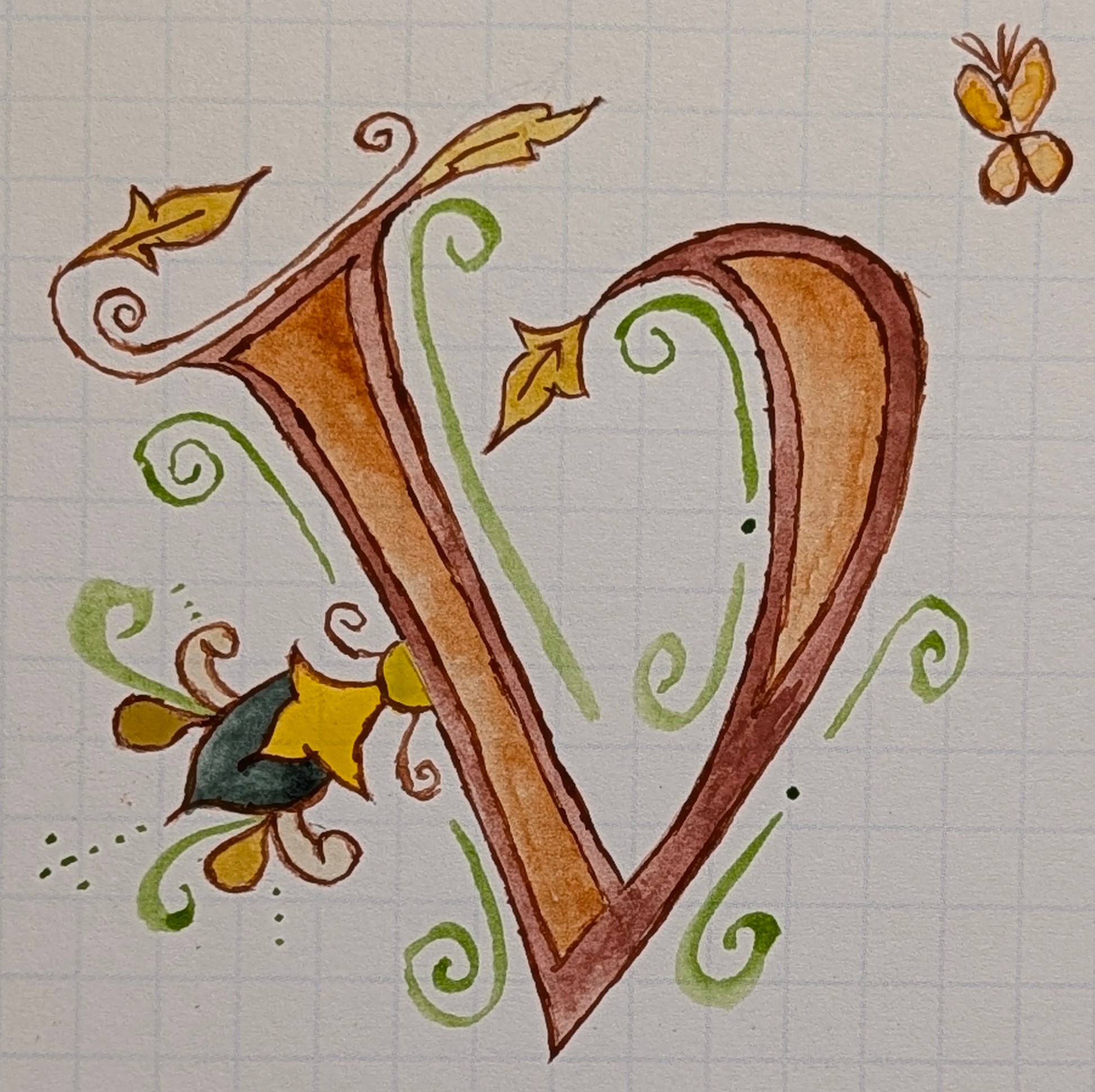
I really enjoy earth tones, especially with watercolor. For this I used Indian Red (iron oxide), sienna and umber, earth green, and yellow ochre. There is something neat about iron based pigments.
W
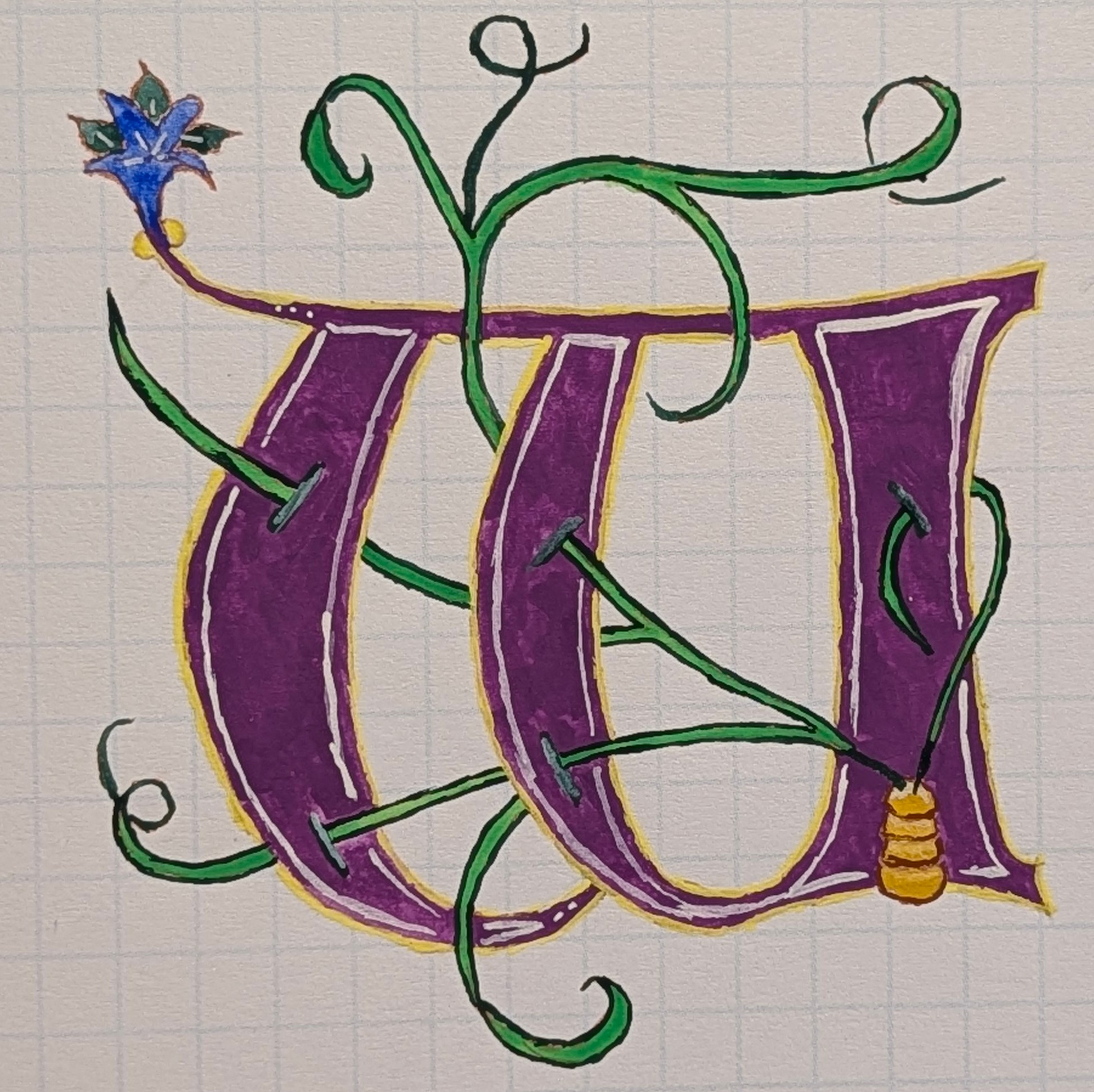
Violet and mid yellow, sap green and deep green, ultramarine blue on the flower. I'm not sure if that is a beehive or a weird pot.
X
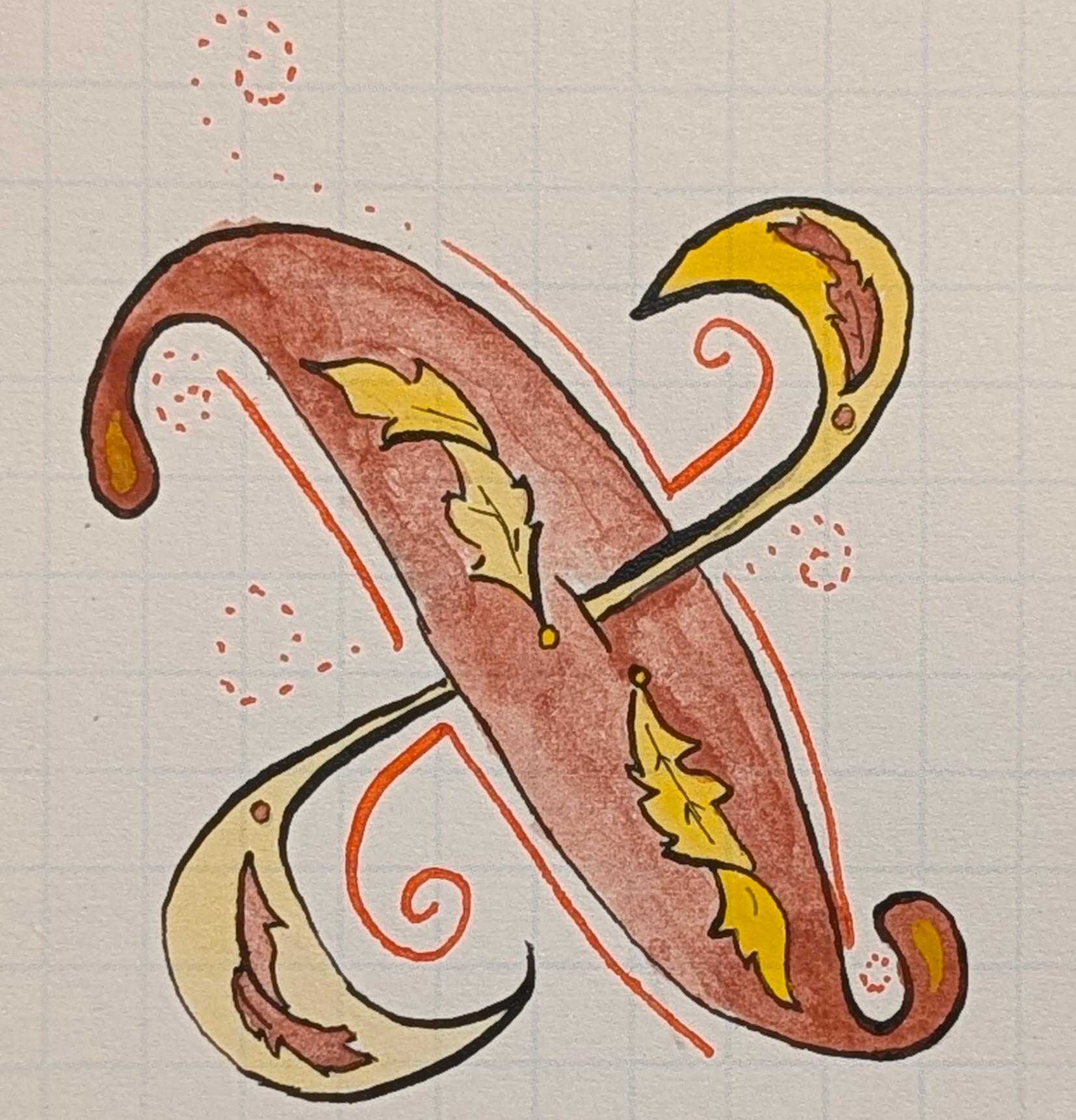
Watercolor Indian Red and Indian yellow make a return for the fall colors in this X with the outline being India Ink. The red lines on the outside were done with Liquitex Vivid Red Orange acrylic ink and a #512 nib.
Y
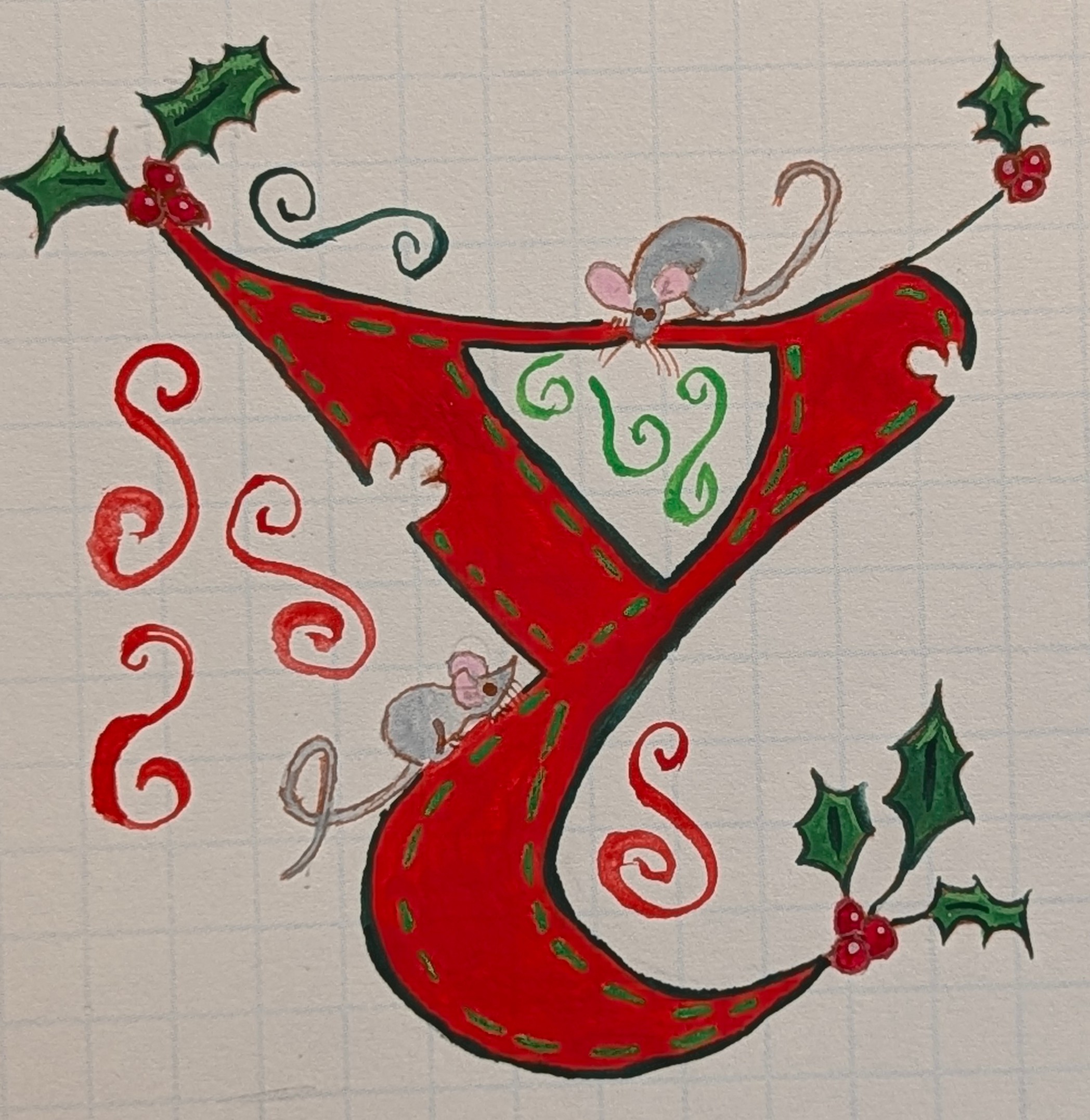
I guess Y is for yuletide. I like the mice. Scarlet is a wonderful color.
Z
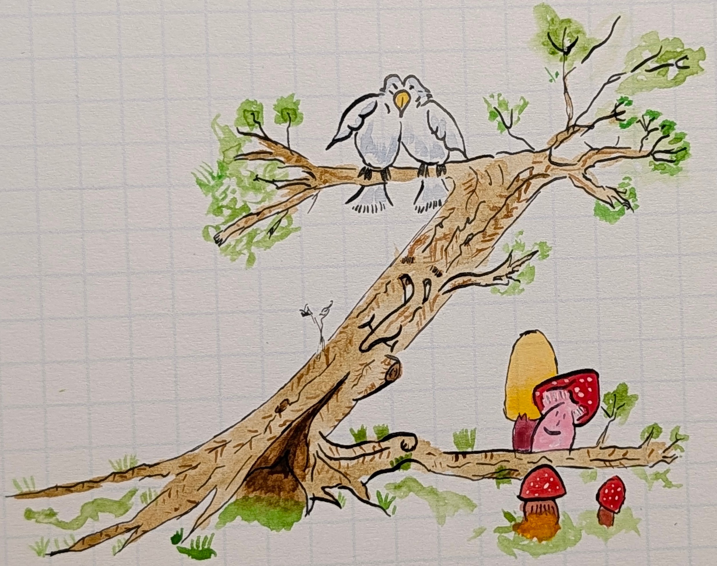
This Z was fun. A bent tree, happy mushrooms, and some doves. Burnt sienna and burnt umber make up the tree's colors, sap green for the grass, primary red + white for the reds and pink. India Ink line work with the #104.
Z
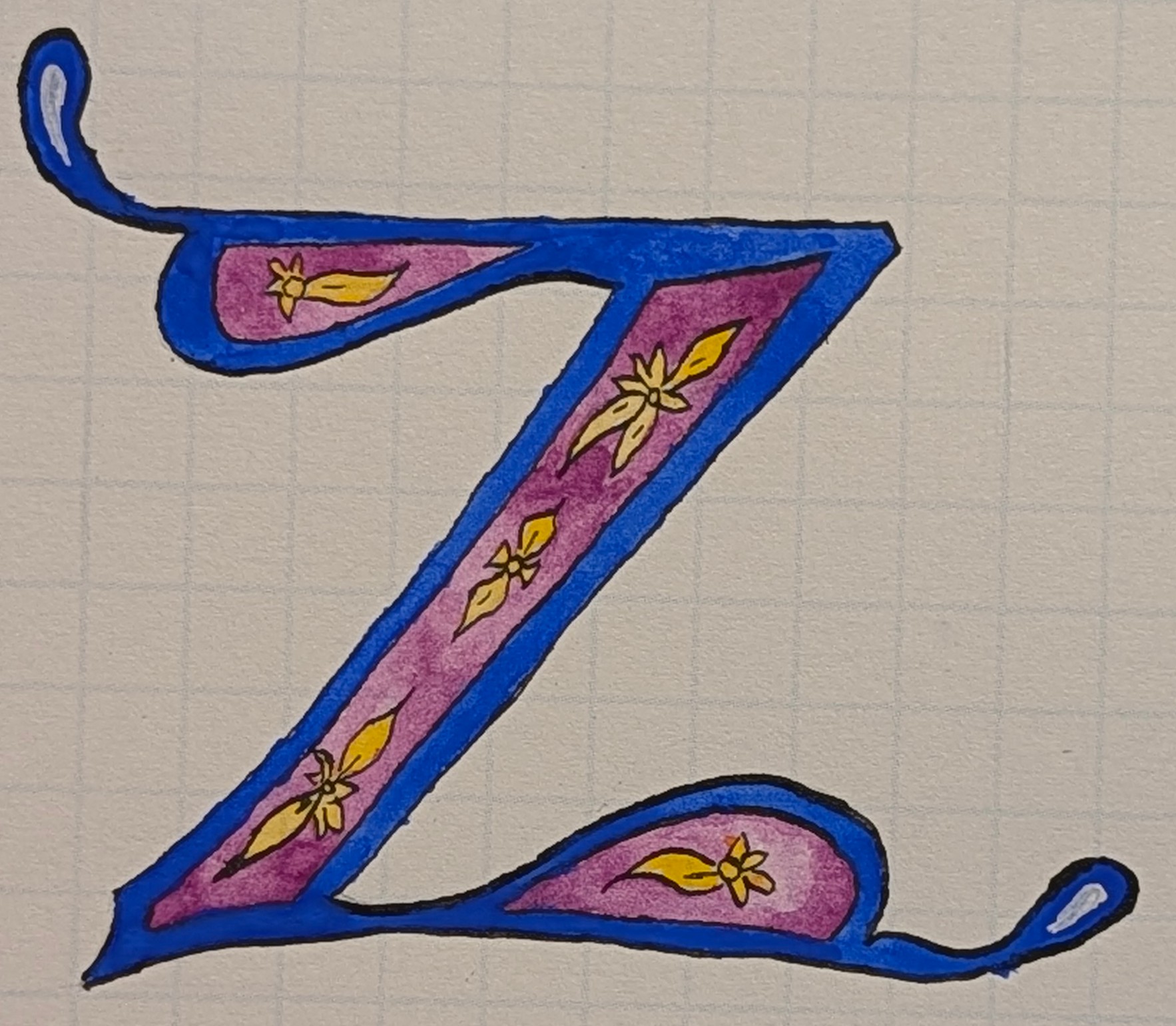
Here I wanted to do another in watercolor, using ultramarine blue (light?) and mauve with some Indian yellow. I just enjoy the way the water moves and how you can make an area dark or lighter just by dabbing some more pigment into a puddle.
And that's it for this Tilde 30.6.